Build a Custom report
The Brinqa Platform comes prepared with various reports and dashboards built specifically for the needs of your organization. This tutorial serves to show how you can build your own custom report from scratch or modify existing reports. While this tutorial uses the Vulnerability data model in each report section, you can use a different data model or different report sections in your own report.
For an overview of the Brinqa report builder, see the Reports article.
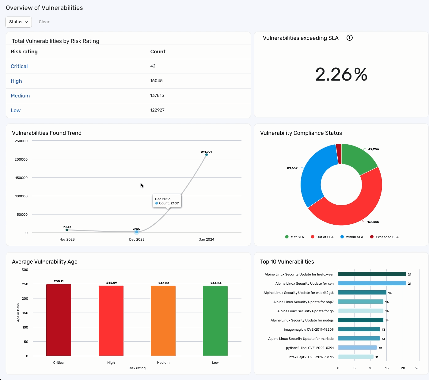
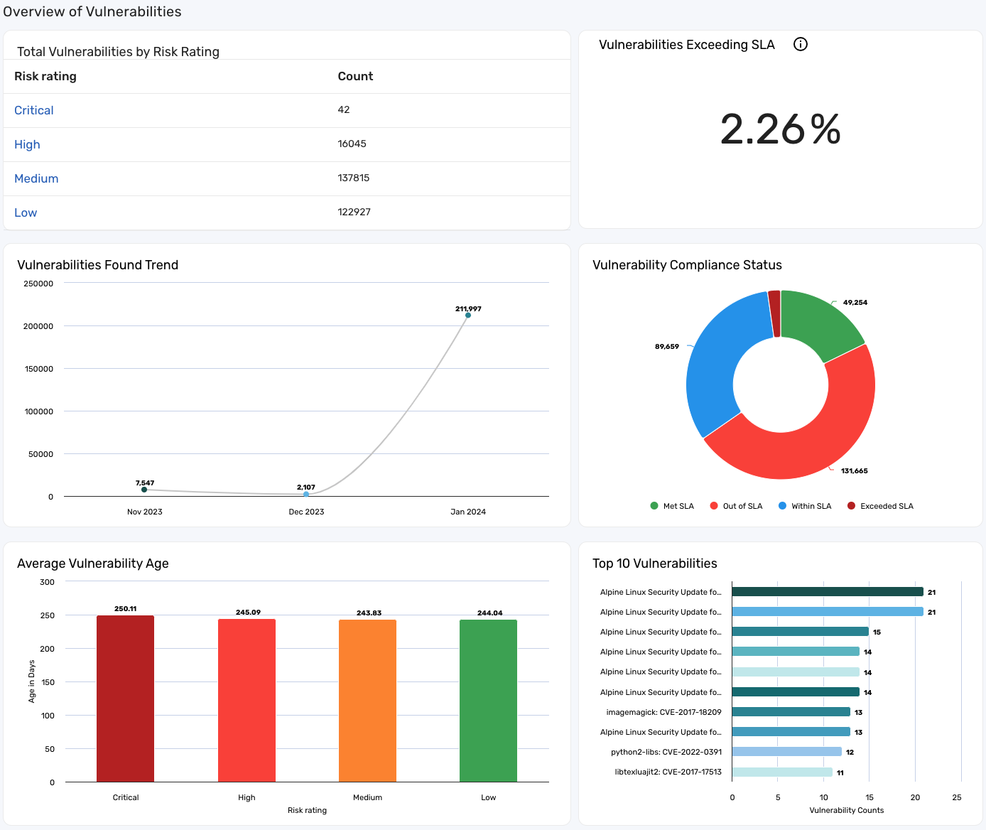
This report example contains the following sections and pieces of data:
1.) Create the report
To create the report, follow these steps:
-
Navigate to Analytics.
-
Click Create and fill in the following fields:
-
Header: Provide a header for your report. For example, "Overview of Vulnerabilities."
-
Title: Provide a title for your report. For example, "Vulnerability Overview Report."
-
Name: The system fills in the name as you type the title, removing any spaces or characters that are not allowed. You do not need to edit this field.
-
Description: Provide a description for your report. For example, "Overview of vulnerabilities by risk rating, count, severity level, and age."
-
-
Click Save.
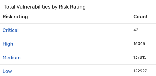
2.) Create a "total vulnerabilities by risk rating" section with drill-downs
You can use the Tabular section to display data from the data model in a table. Adding drill down to the section lets you navigate to the corresponding list view by clicking an entry in the table. For example, to display the current count of vulnerabilities grouped by their risk ratings, follow these steps:
-
Open the "Vulnerability Overview Report" and click Edit.
-
Click Add section
 and select Tabular
  .
. -
Enter a title for the section. For example, "Total Vulnerabilities by Risk Rating".
-
For Data source, choose Vulnerability. This ensures the section pulls information from the Vulnerability data model.
-
For Measures, click +. A pane appears.
-
For Function, choose Count. This provides you with a count of all vulnerabilities.
-
Leave the Attribute field blank and leave the Display as field as is.
-
Click Update.
-
-
For Dimension, click +. A pane appears.
-
For Attribute, choose Risk rating. This groups the vulnerabilities by their risk rating.
-
Click Update.
-
-
For Sort by, click +. A pane appears.
-
For Attribute, choose Risk rating. This sorts the vulnerabilities by their risk rating.
-
For Direction, choose Descending. This sorts the vulnerabilities in descending order, starting with Critical.
-
Click Update.
-
-
Navigate to Style > Drill-down and click Create drill down. A new window appears.
noteIn Brinqa Platform version 11.31 or later, the Drill down section is located in the Setup tab.
-
Dimension drill-down allows you to set which column in the tabular to enable the drill down. For this example, enable Dimension drilldown.
-
From the Columns menu, select Risk rating.
-
From the On click menu, select Link to list view. More options appear below.
-
Select Open in a new tab if you want the drill down to open in a new tab.
-
Leave the default Parameters setting as is. {{riskRating}} means that the drill down changes dynamically depending on the risk rating. For example, when you click Critical, the drill down takes you to the list of critical vulnerabilities; when you click Medium, the drill down takes you to the list of medium vulnerabilities.
-
Include section filter in drill down parameters is selected by default. Since we have not set any filters, the values are empty and you can leave them as is.
-
Click Create.
The "Total Vulnerabilities by Risk Rating" section appears on the report.
-
-
Click Update.
You can now click a risk rating in the table to navigate to all vulnerabilities with that specific risk rating. For example, click Critical to navigate to a list view of all critical vulnerabilities.
The following screenshot illustrates what the tabular section may look like:
3.) Create a "vulnerabilities found trend" section
You can use a line graph to display data that changes over time. When building a line graph, dimensions determine the X-axis, and measures populate the Y-axis. If you choose a line chart, at least one of your dimensions should be time-related.
To create a line chart showing vulnerabilities found each month, follow these steps:
-
Open the "Vulnerability Overview Report" and click Edit.
-
Click Add section
and select Line  .
. -
Enter a title for the section. For example, "Vulnerabilities Found Trend".
-
For Data source, choose Vulnerability. This ensures the section pulls information from the Vulnerability data model.
-
For Measures, click +. A pane appears.
-
For Function, choose Count. This provides you with a count of all vulnerabilities.
-
Leave the Attribute field blank and leave the Display as field as is.
-
Click Update.
-
-
For Dimensions, click +. A pane appears.
-
For Attribute, choose First Found. The First found field is a timestamp, so you can select which part of the timestamp is relevant for the graph using the Transformation field.
-
From the Transformation menu, select Month of year, which shows the number of vulnerabilities by the month of the year in which they were found.
-
Click Update.
-
-
For Filter, click +. A window appears.
-
For Attribute, choose First found.
-
For Operator, choose In last.
-
For Number, type 12.
-
For Units, choose Months.
The above settings filter the vulnerabilities by those that have been discovered in the last 12 months.
-
Click Update.
-
-
For Limit, click the dropdown and select 25. This limits the line chart to display 25 data points.
-
Navigate to Style > Color and choose Color by data point. This displays data points in different colors.
-
Navigate to Style > Options and choose Show value, Show grid lines, and Smooth lines. This makes the graph line less angular, displays grid lines, and displays the number of vulnerabilities per month.
-
The "Vulnerabilities Found Trend" section appears on top of the first section. Drag the section to a more desirable location in the report.
-
Click Update.
The following screenshot illustrates what the line chart section may look like:
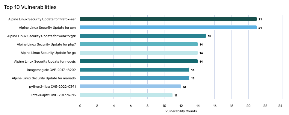
4.) Create a "top 10 vulnerabilities" section
You can use a bar chart to display bars of data. Bar and Column charts can be used interchangeably, but bars may work better when the bar labels are long. When building a bar graph, dimensions determine the X-axis and measures determine what populates the Y-axis.
To create a bar graph showing the top 10 vulnerabilities, follow these steps:
-
Open the "Vulnerability Overview Report" and click Edit.
-
Click Add section
and select Bar  .
. -
Enter a title for the section. For example, "Top 10 Vulnerabilities".
-
For Data source, choose Vulnerability. This ensures the section pulls information from the Vulnerability data model.
-
For Measures, click +. A pane appears.
-
For Function, choose Count. This provides you with a count of all vulnerabilities.
-
Leave the Attribute field blank and leave the Display field as is.
-
Click Update.
-
-
For Dimensions, click +. A pane appears.
-
For Attribute, choose Display name. This groups the vulnerabilities by their display names.
-
Click Update.
-
-
For Sort by, click +. A pane appears.
-
For Attribute, choose Count. This sorts the graph by vulnerability count.
-
For Direction, choose Descending. This sorts the graph in descending order, starting with the vulnerability with the highest count.
-
Click Update.
-
-
Navigate to Style > Colors and choose Color by data point. This displays data points in different colors.
-
Navigate to Style > Options and select Show value and Show grid lines. This displays grid lines and displays the number of vulnerabilities on the graph.
-
Navigate to Style > Horizontal axis and type "Vulnerability Counts" in the Title field. This displays "Vulnerability Counts" on the horizontal axis of the chart.
-
The "Top 10 Vulnerabilities" section appears on top of the first section. Drag the section to a more desirable location in the report.
-
Click Update.
The following screenshot illustrates what the bar chart section may look like:
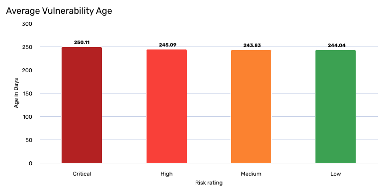
5.) Create an "average vulnerability age" section
You can use a column chart to display data in columns. When building a column graph, dimensions determine the X-axis and measures determine what populates the Y-axis.
To create a column graph showing the average age of vulnerabilities, follow these steps:
-
Open the "Vulnerability Overview Report" and click Edit.
-
Click Add section
and select Column  .
. -
Enter a title for the section. For example, "Average Vulnerability Age".
-
For Data source, choose Vulnerability. This ensures that the section pulls information from the Vulnerability data model.
-
For Measures, click +. A pane appears.
-
For Function, choose Average. This provides you with an average value of the Age in days attribute.
-
For Attribute, choose Age in days.
-
Leave the Display as field as is.
-
Click Update.
-
-
For Dimensions, click +. A pane appears.
-
For Attribute, choose Risk rating. This groups the vulnerabilities by their risk rating.
-
Leave the Display as field as is.
-
Click Update.
-
-
For Sort by, click +. A pane appears.
-
For Attribute, choose Risk rating. This sorts the graph by risk rating.
-
For Direction, choose Descending. This sorts the graph in descending order, starting with the critical risk rating.
-
Click Update.
-
-
Navigate to Style > Color and choose Conditional colors. Conditional colors can enhance the visual representation of your reports by applying specific colors based on certain values. For additional information, see Conditional colors.
-
In the Equals to box, type the exact name of the value you want to set a color for. For example, to specify a color for the
Criticalseverity level, type "Critical" in the Equals to box.cautionThe text in the Equals to box is case-sensitive and must be an exact match in order to work properly. For example, if you were to type "critical", the conditional color does not apply properly. You must type "Critical" with an uppercase "C". The same applies to "Low", "Medium", and "High".
-
-
Click the Background color paint bucket icon and select a color for the bar. For example, a finding with a critical severity may best be represented by a dark red color, low by a light green color, and etc.
-
Repeat steps 8 and 9 for each risk rating value (Low, Medium, and High).
-
Navigate to Style > Vertical axis, type "Age in Days" for the Title, and select Display labels to ensure "Age in Days" displays on the axis.
-
Navigate to Style > Horizontal axis, type "Risk rating" for the Title, and select Display labels to ensure "Risk rating" display under the axis.
-
Navigate to Style > Options and select Show value and Show grid lines. This displays grid lines and displays the average age of vulnerabilities on the graph.
-
The "Average Vulnerability Age" section appears on top of the first section. Drag the section to a more desirable location in the report.
-
Click Update.
The following screenshot illustrates what the column chart section may look like:
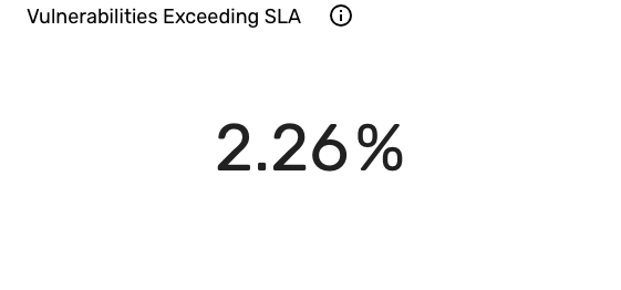
6.) Create a "vulnerabilities exceeding SLA" section
You can use a single value section to display specific data points as percentages of a larger dataset or to show other single values such as counts and sums.
To create a single value section showing the percentage of vulnerabilities that have exceeded their SLA compliance status, follow these steps:
-
Open the "Vulnerability Overview Report" and click Edit.
-
Click Add section
and select Single value  .
. -
Enter a title for the section. For example, "Vulnerabilities Exceeding SLA".
-
For Data source, choose Vulnerability. This ensures that the section pulls information from the Vulnerability data model.
-
For Measures, click +. A pane appears.
-
For Function, choose Percentage. This provides you with a percentage value.
-
For Comparison filter, click the Attribute dropdown and select Compliance status.
-
For the Operator, click the dropdown and select Equals to.
-
For the Value, click the dropdown and select Exceeded SLA, and then click Update. This provides you with all vulnerabilities with a compliance status of "Exceeded SLA".]
-
-
Navigate to Style > Hint and type a hint that explains how the percentage is calculated. For example, you can write: "This percentage represents the count of vulnerabilities that exceed SLA over the total count of vulnerabilities". This hint can help report viewers understand the context behind the displayed percentage.
-
Navigate to Style > Labels and in the After label field, type %, and then set the size to match the text of the value in the section. This displays a percentage sign (%) after the value in the single value section.
-
The "Vulnerabilities exceeding SLA" section appears on top of the first section. Drag the section to a more desirable location in the report.
-
Click Update.
The following screenshot illustrates what the single value section may look like:
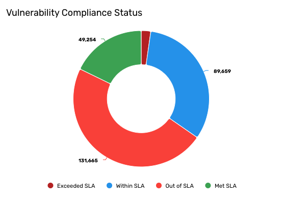
7.) Create a Vulnerability compliance status section
You can use a donut chart to visualize vulnerabilities segmented by their compliance status.
To create a donut chart showing vulnerabilities by their compliance status, follow these steps:
-
Open the "Vulnerability Overview Report" and click Edit.
-
Click Add section
and select Donut  .
. -
Enter a title for the section. For example, "Vulnerability Compliance Status".
-
For Data source, choose Vulnerability. This ensures that the section pulls information from the Vulnerability data model.
-
For Measures, click +. A pane appears.
-
For Function, choose Count. This provides you with a count of all vulnerabilities.
-
Leave the Attribute field blank and leave the Display field as is.
-
Click Update.
-
-
For Dimensions, click +. A pane appears.
-
For Attribute, choose Compliance status. This groups the vulnerabilities by their compliance status.
-
Leave the Display as field as is.
-
Click Update.
-
-
Navigate to Style > Color and choose Conditional colors. Conditional colors can enhance the visual representation of your reports by applying specific colors based on certain values. For additional information, see Conditional colors.
-
In the Equals to box, type the exact name of the value you want to set a color for. For example, to specify a color for the
Exceeded SLAcompliance status, type "Exceeded SLA" in the Equals to box.cautionThe text in the Equals to box is case-sensitive and must be an exact match in order to work properly. For example, if you were to type "exceeded SLA", the conditional color does not apply properly. You must type "Exceeded SLA" with an uppercase "E". The same applies to "Met SLA", "Out of SLA", and "Within SLA".
-
-
Click the Background color paint bucket icon and select a color for the bar. For example, a vulnerability with a compliance status of "Exceeded SLA" may best be represented by a dark red color, "Met SLA" by a light green color, and etc.
-
Repeat steps 7 and 8 for each compliance status value (Met SLA, Out of SLA, and Within SLA).
-
Navigate to Style > Options and select Show value. This displays the number of vulnerabilities per compliance status on the graph.
-
The "Vulnerability Compliance Status" appears on top of the first section. Drag the section to a more desirable location in the report.
-
Click Update.
The following screenshot illustrates what the donut chart may look like:
8.) Apply an input to the report
You can add an input to the report, which enables you to dynamically filter the contents of the entire report without needing to add additional dimensions to each report section. For example, to add an input to the vulnerability report that can filter the vulnerabilities by their status, follow these steps:
-
Open the "Vulnerability Overview Report" and click Edit.
-
Click Inputs
 .
. -
Click the Data model dropdown and choose Vulnerability.
-
Click Add inputs, select the Status attribute, and then click Add.
The Status attribute displays as filters at the top of the report. You can use this new input like you would a basic search filter.
-
Click Update to save your changes.
-
Click the Status attribute and choose the status category you want to filter for. Options include: Assumed fixed, Confirmed active, Confirmed fixed, False positive, Reopened, Risk accepted, Risk temporarily accepted, or Unknown. You can select multiple values.
Your entire report updates displaying the graphs based on the vulnerabilities with the selected status category: