Analytics source
Analytics source are currently in beta. This documentation is subject to change as the feature develops. Please check back regularly for the latest information.
Analytics source is not available in the initial release of Brinqa Platform version 12. This feature is scheduled to be available in a future version 12 update. Dashboards that rely on Analytics source have been removed in the initial release and will be restored when Analytics source becomes available.
What is Analytics source?
Analytics source simplifies visualizations by providing a snapshot-based, trend-focused approach without the need for extensive modifications. You can use Analytics source in your visualizations to choose from a variety of predefined datasets, simplifying the creation process by eliminating the need for creating an indicator and using a Brinqa Query Language (BQL) query. Analytics source automatically processes data snapshots daily, making it the preferred source type for efficiently analyzing and visualizing your data.
Built-in analytics sources
The Brinqa Platform comes with a variety of built-in Analytics sources, each tailored to a specific type of dataset. The table below outlines these sources:
| Analytics source | Description |
|---|---|
| All app event logs | Provides snapshots of all application event logs in the Brinqa Platform captured during data orchestration. |
| All assets | Provides snapshots of all assets in the Brinqa Platform captured during data orchestration. |
| All cluster models | Provides snapshots of all cluster models in the Brinqa Platform captured during data orchestration. |
| All data integration identifiers | Provides snapshots of all data integration identifiers in the Brinqa Platform captured during data orchestration. |
| All data integration record types | Provides snapshots of all data integration record types in the Brinqa Platform captured during data orchestration. |
| All data model compute metrics | Provides snapshots of all data model compute metrics in the Brinqa Platform captured during data orchestration. |
| All data server metrics | Provides snapshots of all data server metric attributes in the Brinqa Platform captured during data orchestration. |
| All findings | Provides snapshots of all findings in the Brinqa Platform captured during data orchestration. |
| All finding definitions | Provides snapshots of all finding definitions in the Brinqa Platform captured during data orchestration. |
| All installed packages | Provides snapshots of all installed software packages in the Brinqa Platform captured during data orchestration. |
| All orchestration runs | Provides snapshots of all data orchestration runs in the Brinqa Platform captured during data orchestration. |
| All people | Provides snapshots of all persons in your organization's network in the Brinqa Platform captured during data orchestration. |
| All requests | Provides snapshots of all requests (remediation, exception) in the Brinqa Platform captured during data orchestration. |
| All tickets | Provides snapshots of all tickets in the Brinqa Platform captured during data orchestration. |
| All users | Provides snapshots of all user profiles in the Brinqa Platform captured during data orchestration. |
Create a visualization with an analytics source
The steps for creating and customizing a visualization when you use Analytics source are similar to using a data model or indicator, with a few different options. To create a visualization with an analytics source, follow these steps:
-
Navigate to Analytics > Visualizations.
-
Click Create.
-
In the Setup tab, fill in the fields below:
-
Title: Give your visualization a title.
-
Source type: Click the dropdown and select Analytics source.
-
Header: (Optional) Enter a header for the visualization or check the Hide header box to hide it.
-
Analytics source: Click the dropdown and select the dataset you want to visualize.
-
Chart type: Click the dropdown and select the type of chart you want to use in your visualization. Analytics source supports multiple chart types.
- The customization options for your visualization depends on the chart type you select. The following options display when you select Trend value, which provides trending information in your visualization.
-
Measure: Click the dropdown and select a measure. Measures determine how the data is aggregated or calculated on the specified datasets. See Measures for additional information.
-
Direction: Set your objective for the visualization's measure. The chosen direction doesn't alter the data; rather, it can help you clarify whether you aim to minimize or maximize the values over time. It can serve as a guide for how you interpret the data. For instance, if you set the direction to Minimize, you are saying that lower values are preferable for your goals, while Maximize suggests the opposite. Arrows in the visualization indicate trend direction:
-
Green arrow: Trend aligns with your objective (increasing for Maximize, decreasing for Minimize).
-
Red arrow: Trend opposes your objective (decreasing for Maximize, increasing for Minimize).
-
Gray arrow: No significant change in trend.
-
There are three direction options to choose from:
-
None: Do not specify a direction.
-
Minimize: Signifies that you aim to decrease the targeted metrics over time, indicating that a lower value is preferable.
-
Maximize: Signifies that you aim to raise the targeted metrics over time, indicating that a higher value is preferable.
-
-
-
Sort by: Sort the information displayed in the visualization. Options include: Unordered, Ascending or Descending.
-
Add a filter: Add and define a filter. A window displays with a few options:
-
Attribute: An attribute that exists on the data model. The dimension options differ depending on the Analytics source you are using in the visualization.
-
Operator: Different attributes have different possible operators. For instance, the operators for date attributes such as “First found” are different compared to status attributes.
-
Value: The values associated with the attribute. For instance, if you select Status as the dimension for assets, possible values include Active and Inactive.
-
Click Update to apply the filter to the visualization.
-
-
If you select Trend value for your chart type, Show last updated, Show trend, Show change,Show percentage, and Show indicator title display and are checked by default. Leave these as is. Selecting these options ensures that when the data changes, the visualization updates to show those updates automatically.
-
-
You can also customize the appearance of a visualization similar to customizing dashboards. See customize section appearance for additional information.
-
Click Save.
The Visualization page reloads and your new visualization displays in the list view. If you do not see it, refresh the page.
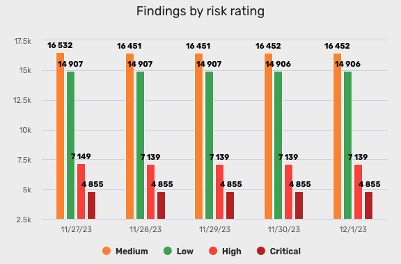
Tutorial: Create a visualization with analytics source for findings by risk rating
You can create a visualization for findings grouped by risk rating in the Brinqa Platform to categorize and understand the risk landscape of your security environment. This visualization provides a comprehensive view of findings at various risk rating levels, which can help in prioritizing and addressing security concerns. To create this visualization, follow these steps:
-
Navigate to Analytics > Visualizations.
-
Click Create and fill in the fields as shown below:
-
Title: Type "Findings by risk rating".
-
Source type: Click the dropdown and select Analytics source Beta.
-
Header: Type: "Findings by risk rating".
-
Analytics source: Click the dropdown and select All findings.
-
Chart type: Click the dropdown and select Column.
-
Measure: Click the dropdown and select Count. This provides you with a count of all your latest findings as computed during the last data orchestration sync.
-
Dimensions: Click the dropdown and select Risk rating. This groups the findings by their risk rating.
- Click the Dimension dropdown again and select Trend. This displays historical records of your specified dataset over time as computed during data orchestration.
-
Limit. Indicate how many entries of the dataset you want to display on the chart. If you select 5, the 5 latest data orchestration results are displayed. Select 5.
-
Sort by: Click the dropdown and select Descending. This sorts the chart in descending order, starting with the risk rating level with the highest count of findings.
-
-
Navigate to Style > Size and set the Width to 800 and the Height to 400. This condenses the chart, making it easier to place on a dashboard.
-
Navigate to Style > Text and align the text in the center.
-
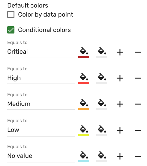
Navigate to Style > Color and select Conditional colors. Fill in the fields as shown below:
-
Equals to: Type "Critical" and set the background color to a shade of dark red, such as "#bf0d1eff".
-
Click + and add another "Equals to" condition. Repeat the same steps for "High", "Medium", "Low", and "No value", picking a corresponding color for each risk rating level. The screenshot below demonstrates what the colors may look like:
-
-
Navigate to Style > Options and select Show grid lines and Show value. This displays lines and makes the finding count values appear on the chart.
-
Navigate to Style > Legend and select Enabled. The legend appears on the chart and displays the risk rating levels and their corresponding colors.
- You can customize where the legend displays on the chart. Click the Layout dropdown and select Horizontal, Center for Position X, and Bottom for Position Y for the legend to be centered in the middle below the chart.
-
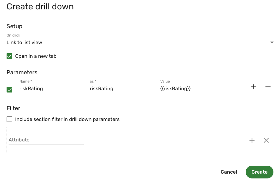
Navigate to Style > Drill down and click Create drill down. A new window appears.
-
From the On click menu, select Link to list view. This will direct you to a list view of the findings by risk rating when you click on the specific portion of the chart.
-
Select Open in a new tab if you want the list view to open in a new tab.
-
Click Add parameters and complete the following fields:
- Name: Type riskRating. The as and Value fields fill in automatically. This parameter means that the drill down changes dynamically depending on the risk rating level. For example, when you click Critical, the drill down takes you to the list view of all findings with a Critical risk rating.
-
Include section filter in drill down parameters is selected by default. Since we have not set any filters, go ahead and uncheck the box.
-
Leave the Attribute field blank.
-
Click Create. The following screenshot illustrates what the drill down settings resemble:
-
-
Click Save.
The Visualization page reloads and the new visualization appears in the list view. Point your cursor over the visualization and click Edit to modify or view the visualization.
The following screenshot illustrates what the "Findings by risk rating" visualization may look like:
You can then add the "Findings by risk rating" visualization to a dashboard. See add a visualization to a dashboard for additional information.
Tutorial: Create a visualization with analytics source for critical finding definitions
You can create a visualization for critical finding definitions in the Brinqa Platform to help you monitor and analyze significant security vulnerabilities. Using an Analytics source and trend value chart for this dataset provides insights into trends in your environment. To create this visualization, follow these steps:
-
Navigate to Analytics > Visualizations.
-
Click Create and fill in the fields as shown below:
-
Title: Type "Critical finding definitions".
-
Source type: Click the dropdown and select Analytics source Beta.
-
Header: Type: "Critical finding definitions".
-
Analytics source: Click the dropdown and select All finding definitions.
-
Chart type: Click the dropdown and select Trend value. The Trend value chart type gives insights into changes on the dataset.
-
Measure: Click the dropdown and select Count. This provides you with a count of all your latest finding definitions as computed during the last data orchestration sync.
-
Direction: Click the dropdown and select Minimize, indicating that the objective of this visualization is to minimize the amount of critical finding definitions.
-
Sort by: Set to Unordered by default. Leave as is.
-
Add a filter: Click Add a filter and complete the following fields to apply a filter that only displays critical finding definitions:
-
Attribute: Click the dropdown and select Severity.
-
Operator: Click the dropdown and select Equals to.
-
Value: Click the dropdown and select Critical.
-
Click Update to save and apply the filter.
-
-
By default, Show last updated, Show trend, Show change, Show percentage, and Show analytics source title are checked. Leave these as is. Selecting these options ensures that when the data changes, the visualization updates to show those updates automatically.
-
-
Click Save.
The Visualization page reloads and the new visualization appears in the list view. Point your cursor over the visualization and click Edit to modify or view the visualization.
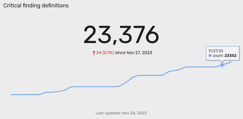
The following screenshot illustrates what the "Critical finding definitions" visualization may look like. Let's break it down:
-
Total count: The visualization displays a total of 23,376 critical finding definitions.
-
Trend direction: The red arrow signifies a trend opposite to the intended minimize direction, indicating an increase in the number of critical finding definitions.
-
Trend counts: On 11/27/23, there were 23,352 critical finding definitions. Since then, the count has risen by 24, reaching 23,376. THis correlates with the red trend arrow.
You can then add the "Critical finding definitions" visualization to a dashboard. See add a visualization to a dashboard for additional information.