Visualizations
This article details visualizations and how to create and manage visualizations in a Brinqa Platform.
What are visualizations?
Visualizations in the Brinqa Platform provide a clear and concise representation of your data, helping you identify trends and patterns more effectively. By creating visualizations, you can essentially build a "library" of your most important data and its visual representations. You can then use and reuse these visualizations throughout the Brinqa Platform without having to recreate them, unlike dashboard sections, which must be recreated for different dashboards or scenarios. The reusable and flexible nature of visualizations ensures consistency across multiple dashboards, saving you both time and effort. By leveraging visualizations, you can streamline your reporting process, allowing you to focus more on analyzing and understanding the data rather than spending time creating the same visual representation repeatedly in various dashboard sections.
For example, let's say you have a dashboard in your Brinqa Platform that displays data pertaining to your findings. This dashboard may contain information such as the total number of findings in your organization, the risk rating of the findings, and the compliance status of the findings, just to name a few. If you use visualizations to create this specific findings dashboard, you can easily plug the same visualizations into different dashboards as needed, increasing efficiency and consistency across your dashboards.
Choosing the right source type for your visualization
When creating visualizations, it's important to select the source type that best aligns with your needs:
-
Data model: Use this option for real-time data and immediate visual representations. It's best used when live, current data analysis is needed.
The steps for creating a visualization with a data model are similar to when you Create a new dashboard section.
-
Indicator: Use this option for tracking specific values over time. Before you can use an indicator in a visualization, you must first create the indicator and define a BQL query. This BQL query enables continuous and precise tracking of the specific datasets you're interested in.
For steps on how to create a visualization using an indicator, see Create a visualization for the all vulnerabilities indicator.
-
Analytics source: Use this option for snapshot and trend-focused visualizations on certain datasets. It is especially suited for displaying data over time, such as illustrating the trend of risk scores for severe vulnerabilities, or determining whether the trend of findings is increasing or decreasing. Analytics source provides flexible, customizable options for data analysis without the need for a BQL query.
infoWhen it comes to dashboards especially for trending data, Brinqa recommends that you use Analytics source, as it is optimized for handling large datasets and provides more effective insights into trends.
For steps on how to create a visualization using an Analytics source, see Create a visualization with an analytics source.
Create a visualization
Users with the Configurator or System Administrator role can create visualizations to represent either a specific data model, Analytics source, or Indicator that has been created in your Brinqa Platform. To create a visualization, follow these steps:
-
Navigate to Analytics > Visualizations.
-
Click Create.
-
In the Setup tab, provide a title, and click the Source type dropdown:
You have three options to choose from: Data model, Indicator, or Analytics source. See Choosing the right source type for your visualization for steps on creating a visualization with each type and understand the associated benefits.
View and manage visualizations
Users with the Configurator or System Administrator role can view and manage existing visualizations. To do so, follow these steps:
-
Navigate to Analytics > Visualizations.
-
To modify a visualization, point your cursor over the visualization and click Edit.
-
Modify the fields as needed and click Update.
Add a visualization to a dashboard
Once you've created a visualization, you can use this visualization throughout the Brinqa Platform, including in dashboards. To add a visualization to a dashboard, follow these steps:
-
Navigate to Analytics > Dashboards.
-
Click the dashboard you want to add the visualization to.
-
Click Edit on the upper-right corner.
-
If you are adding a visualization to a brand new dashboard, you may see an empty area (referred to as a row) at the very top of the dashboard where sections can be added. Click that area to select it.
Column and row toolbars appear above and to the right of the selected row, allowing you to add, edit, or rearrange dashboard sections.
-
Click Add section above the row, then click Choose visualization
 .
. -
The Choose a visualization window appears. Hold the pointer over the visualization you want to add and click Select.
The dashboard refreshes and the visualization displays on the dashboard.
If you're adding a visualization to an existing dashboard, refer to add additional columns or add additional rows for guidance on expanding your dashboard layout to accommodate new visualizations.
You cannot edit the visualization on the dashboard. You must navigate to Analytics > Visualizations if you want to make modifications to the visualization. Any changes made to a visualization automatically apply to the visualization used across your Brinqa Platform. In other words, if you are using it in a dashboard, the changes apply to the visualization on that dashboard.
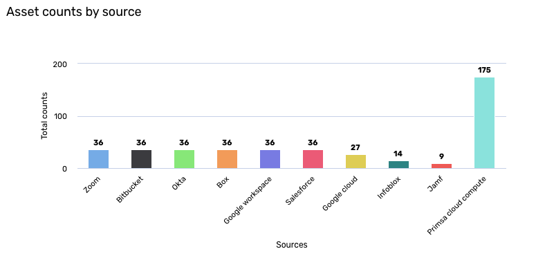
Tutorial: Create a visualization for asset counts by source
This tutorial demonstrates how you can create a visualization to display your overall asset counts by the source. This visualization can help you optimize your asset management by suggesting where you might need to allocate more resources. Additionally, it can serve as a tool for data integration validation, alerting you to potential issues with your connectors if there are unexpected changes in asset counts.
While this tutorial focuses on creating a visualization based on a data model, you can also create a visualization based on indicator.
To create the asset counts by source visualization, follow these steps:
-
Navigate to Analytics > Visualizations.
-
Click Create and fill in the fields as shown below:
-
Title: Type "Overall asset counts by source".
-
Source type: Click the dropdown and select Data model.
-
Section type: Click the dropdown and select Chart.
-
Header: Type "Asset counts by source".
-
Chart type: Click the dropdown and select Column.
-
Data source: Click the dropdown and select or type Asset. This ensures that the visualization pulls information from the Asset data model.
-
Measures: Click +. A pane appears.
-
For Function, choose Count. This provides you with a count of all assets.
-
Leave the Attribute field blank and leave the Display as field as is.
-
Click Update.
-
-
Dimensions: Click +. A pane appears.
-
For Attribute, choose Sources. This provides you with the data sources that are pulling in the asset information.
-
Leave the Display as field as is.
-
Click Update.
-
-
Leave the rest of the fields below Dimensions as is.
-
-
Navigate to Style > Color and choose Color by data point. This displays the data points in different colors, providing a cleaner appearance.
-
Navigate to Style > Options and choose Show value and Show grid lines. This displays grid lines on the graph and displays the number of assets per data source on each column.
-
Navigate to Style > Vertical axis, type "Total counts" in the Title field, and then choose Display labels. This displays "Total counts" on the vertical axis of the graph.
-
Navigate to Style > Horizontal axis, type "Sources" in the Title field, and then choose Display labels. This displays "Source" on the horizontal axis of the graph.
-
Navigate to Style > Legend and make sure Enabled is not selected. This provides a cleaner appearance.
-
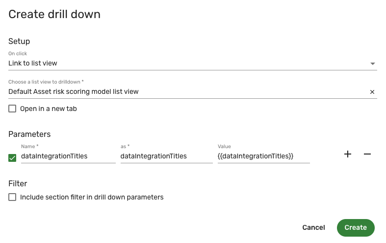
Navigate to Style > Drill down and click Create drill down. A new window appears.
noteIn Brinqa Platform version 11.31 or later, the Drill down section is located in the Setup tab.
-
From the On click menu, select Link to list view. This will direct you to a list view of the assets by source when you click on the specific column.
-
From the Choose a list view to drilldown menu, select Default asset list view. More options appear below.
-
Select Open in a new tab if you want the drill down to open in a new tab.
-
Click Add parameters and complete the following fields:
- Name: Type dataIntegrationTitles. The as and Value fields fill in automatically. This parameter means that the drill down changes dynamically depending on the data integration. For example, when you click Prisma cloud compute, the drill down takes you to the list of assets coming in from the Prisma cloud compute data integration.
-
Include section filter in drill down parameters is not selected by default. Since we have not set any filters, you can leave this box unchecked.
-
Click Create. The following screenshot illustrates what the drill down settings resemble:
-
-
Click Save.
The Visualization page reloads and the new visualization appears in the list view. Point your cursor over the visualization and click Edit to modify or view the visualization.
The following screenshot illustrates what the "Overall asset counts by source" may look like:
You can then add the "Overall asset counts by source" visualization to a dashboard. See add a visualization to a dashboard for additional information.