Explorer
This article details the Explorer page in the Brinqa Platform, the different modes, how to use it to run BQL queries, build charts, and copy them into dashboards.
What is Explorer?
The Explorer page in the Brinqa Platform enables you to interactively explore data using Brinqa Query Language (BQL). Think of Explorer as a workspace where you can experiment with queries, visualize relationships between your datasets, and create charts and visualizations before adding them to dashboards.
Explorer modes
The Explorer page has 3 different modes for interacting with your data:
-
Chart mode: Generate charts from your query results, which you can then save to use in dashboards.
-
Spider graph mode: Visualizes relationships between datasets in a graph format.
-
Table mode: Displays query results in a structured list view format, similar to the Findings or Assets page.
Chart mode
The Chart mode enables you to visualize the results of your BQL queries as charts, which you can then customize and copy into dashboards. All BQL queries used in chart mode must contain RETURN in the query. For additional information, see RETURN.
Chart mode was introduced in Brinqa Platform version 11.30. Brinqa strongly recommends upgrading to the latest platform version to take full advantage of the functionality.
Click the chart icon to enter this mode.
The Chart mode consists of several different options to customize your chart and use it in dashboards or visualizations:
-
Change chart type: Switch between supported chart types such as bar chart, pie chart, or line chart.
-
Filter: Apply additional filters to refine the data shown in the chart without modifying the BQL query. The filter process works the same way as in dashboards.
-
Attribute Name: The attribute to filter on (such as Compliance status, Risk rating, or Status).
-
Operator: The BQL comparison operator to use (such as Exists, Equals to, or Is any of). For additional information, see BQL comparison operators.
-
Value: The value that the operator compares the data to.
The following screenshot illustrates filtering by Status where the value is Confirmed active:

-
-
Copy to clipboard: Copy the chart and its configuration to your clipboard so it can be pasted into a dashboard.
-
Save as a Visualization: Save the chart as a reusable visualization that can be added to multiple dashboards.
In addition to customizing and saving charts, Chart mode also supports the following features:
-
Export the data in a CSV file to share with others, or edit and view in a third-party spreadsheet application.
-
Drill-down into results) and open a filtered list view based on the chart's BQL query in a new tab. Drill-downs in Chart mode apply automatically and require no additional configuration.
Spider graph mode
The Spider graph mode enables you to query any dataset and visualize relationships in an interactive graph format. Unlike other pages, such as the Findings page (which facilitates querying findings or their child data models) or the Inventory page (which facilitates querying assets or their child data models), Explorer allows querying across any data model.
Click the spider graph icon to enter this mode.
To showcase how the spider graph mode functions, consider the following example query, which retrieves all active and critical findings identified in the last 60 days:
FIND Finding AS f WHERE f.status = "Confirmed active"
AND f.riskRating = "Critical"
AND f.firstFound IN LAST 60 Days
After running the above query, Explorer displays the results as a graph:
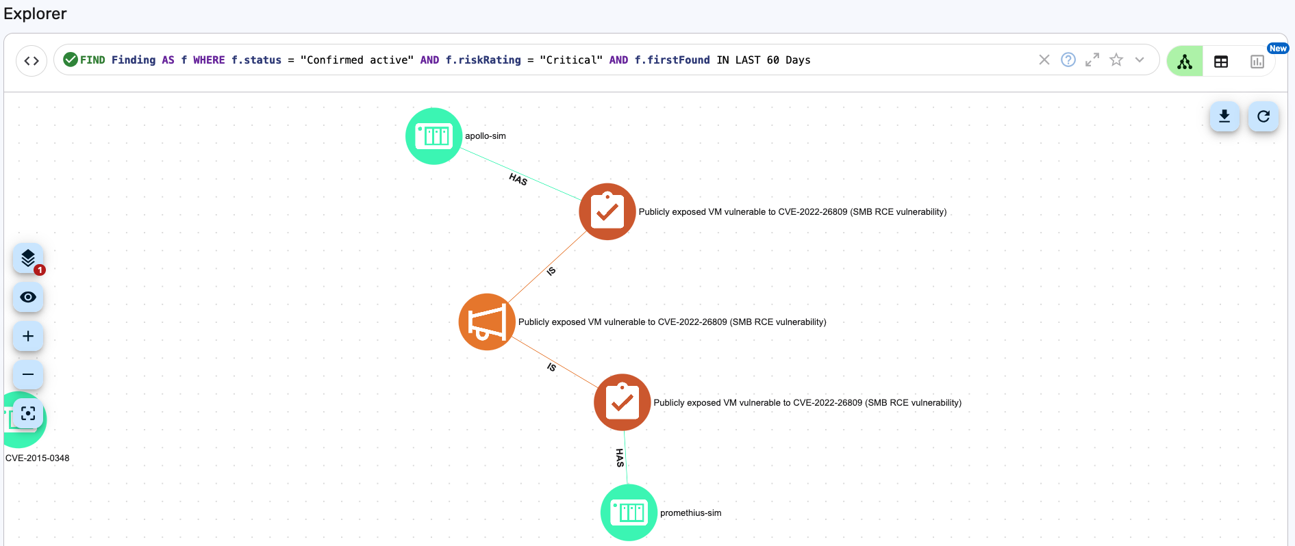
Each node in the graph represents a data model, while the edges (lines) between them indicate their relationships. Here's how to interpret the results:
-
Green nodes represent assets (e.g., apollo-sim, promethius-sim). In this example, these represent different Containers.
-
Red nodes with a checklist icon represent findings (e.g., Publicly exposed VM vulnerable to CVE-2022-26809). In this example, these represent a Violation that is found on the containers.
-
Orange nodes with a megaphone icon represent finding definitions. In this example, this is a Violation Definition.
-
The lines between the nodes describe how the datasets relate to each other. For example, in the above query:
- ASSET
HASFINDING - FINDING
ISFINDING DEFINITION
For additional information on relationships, see Query for relationships in BQL.
You can click one of the nodes to view detailed information about the dataset. For example, clicking the
apollo-simnode opens the Show view about the container. Information might include status, risk score, compliance status, cluster, technologies, and more: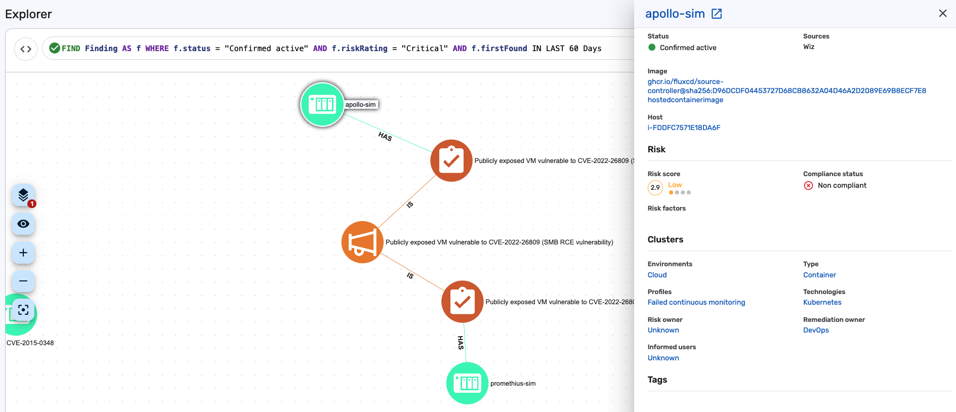
- ASSET
Table mode
The Table mode displays query results in a structured list format, making it easy to read and analyze data.
Click the table icon to enter this mode.
In Table mode, you can:
-
Modify the list view columns to customize the attributes displayed in the table.
-
Export the data in a CSV file to share with others, or edit and view in a third-party spreadsheet application.
-
Click any entry in the list to view detailed information about the finding, asset, or other data model targeted in the BQL query.
For example, the following BQL query was executed in Table mode to retrieve all active and critical findings identified in the last 60 days:
FIND Finding AS f WHERE f.status = "Confirmed active"
AND f.riskRating = "Critical"
AND f.firstFound IN LAST 60 Days

Tutorial: Use Explorer to create a Visualization
You can use Explorer to create a chart from a BQL query and preview how it will appear before adding it to a dashboard. To do so, follow these steps:
-
Navigate to Explorer.
-
Click the Chart icon
.
-
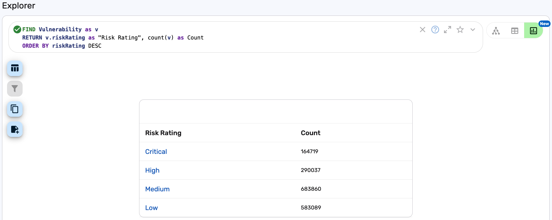
Type a BQL query that defines the data you want to visualize. For example, the following query retrieves all vulnerabilities and their counts by risk rating level, displaying results in descending order, starting with "Critical":
FIND Vulnerability as vRETURN v.riskRating as "Risk Rating", count(v) as CountORDER BY riskRating DESCinfoAll BQL queries used in chart mode must use
RETURNas part of the query. For additional information, see RETURN. -
Press Enter or Return to run the query and create the chart.
 tip
tipIf your query returns only one aggregated measure (for example,
MAX,MIN), Explorer automatically displays a single value chart instead of a table:FIND Finding AS f RETURN DISTINCT MAX(f.baseRiskScore) AS "Max (Base risk score)"LIMIT 10The above query displays a single value section instead of a table.
From here, we now have a few options. We can change the chart type, copy the table to the clipboard to paste in the source of a dashboard, effectively cloning the table, or we can save the table as a visualization and customize the chart or table further. Let's proceed with changing the chart type and saving it as a visualization:
-
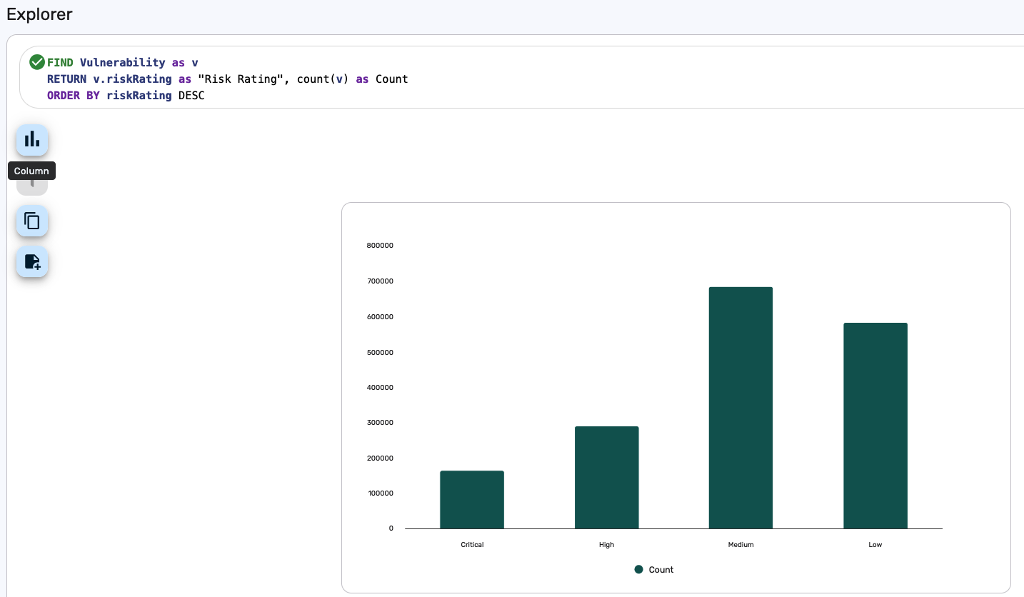
Click Chart type
and select Column.
The table converts to a column chart.
-
Click Save as a Visualization
.
The "Create visualization" dialog displays.
-
Give the visualization a title. For example, "Vulnerabilities by Risk Rating".
-
Click Save.
-
This visualization can then be customized and used in a dashboard. For additional information, see the following:
Tutorial: Copy a chart from Explorer into a dashboard
After generating a chart in Explorer, you can copy it to your clipboard and paste it into a dashboard. To copy a chart from Explorer into a dashboard, follow these steps:
-
Navigate to Explorer and click the Chart icon
.
-
Enter a valid BQL query using the
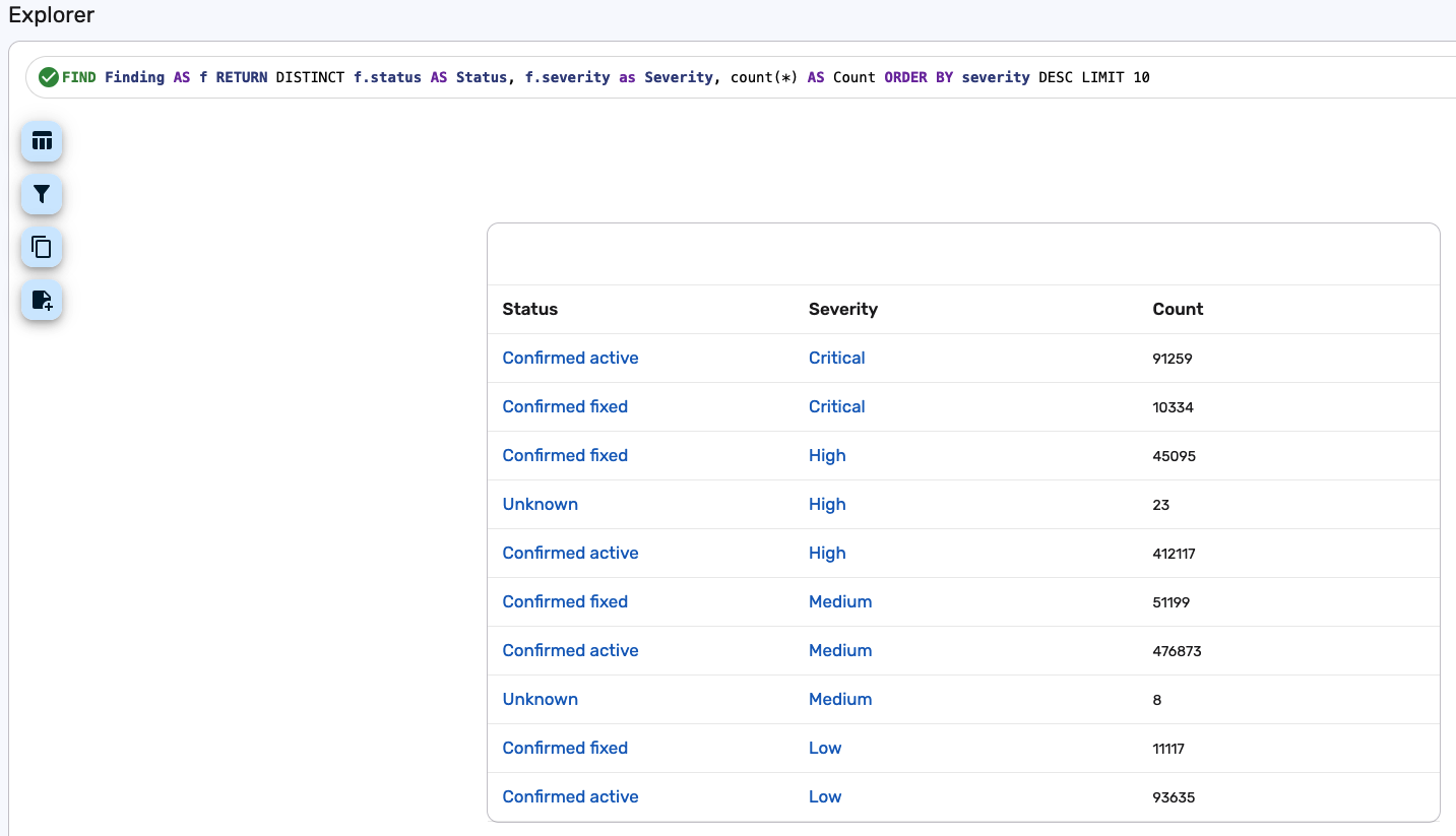
RETURNkeyword. For example, the following query returns a count of findings grouped by status and severity:FIND Finding AS fRETURN DISTINCT f.status AS Status, f.severity AS Severity, COUNT(*) AS CountORDER BY severity DESCLIMIT 10 -
Press Enter or Return to run the query. Explorer displays the results in a tabular format by default.
-
Once the chart appears, click Copy to clipboard
.
-
Navigate to Analytics > Dashboards.
-
Create a new dashboard or edit an existing dashboard to paste this chart to.
-
Paste the chart into the dashboard using your operating system's standard keyboard paste shortcut, or click the View source button
and paste the JSON directly into the dashboard source.
-
Once you've pasted the chart to the dashboard, click Update.
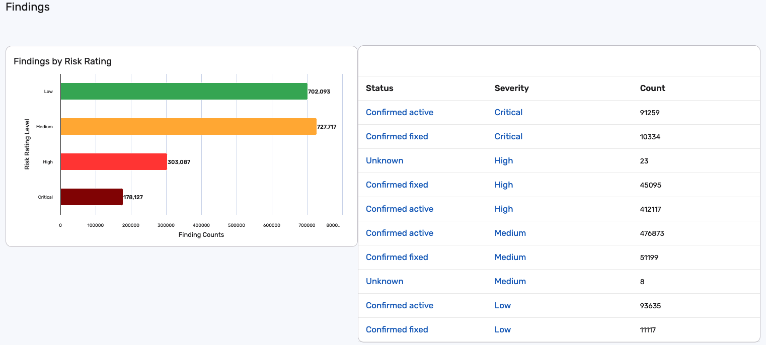
The chart generated from the BQL query in Explorer is now added to your dashboard.