Brinqa Administrator Dashboards
This article details the Brinqa Administrator dashboards, designed to provide Brinqa administrators with a comprehensive overview of different aspects of the Brinqa Platform. The dashboards are composed of four main dashboards — Data Quality, Operations, System Health, and User Management — each offering targeted insights and management tools to enhance the Brinqa Platform's usability for all users.
To access the Brinqa Administrator dashboards, navigate to Dashboards, expand the left-hand side navigation menu, and then click one of the dashboards under the System administration dropdown.
Data quality dashboard
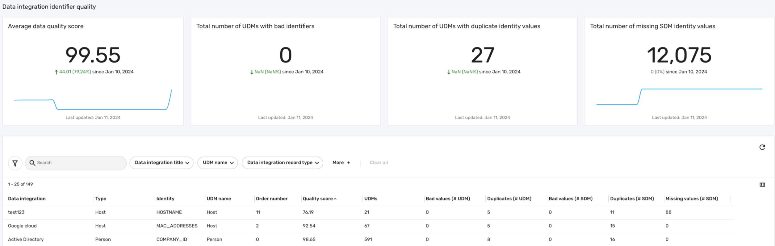
The Data quality dashboard provides administrators with a comprehensive view of their data consolidated from various sources. It calculates an average data quality score to assess the integrity and reliability of incoming data, spotlighting gaps in your data sources to effectively validate your data. This dashboard also shows the number of problematic identifiers, ensuring the accuracy of the consolidated data within the Brinqa Platform. The following screenshot illustrates what your Data quality dashboard may look like:
Key features
The Data quality dashboard includes various metrics and visualizations that provide administrators with an in-depth analysis of data integrity. The following table details some key features of the dashboard:
Table 2: Data quality dashboard features
| Feature | Description |
|---|---|
| Average data quality score | Displays the average data score across all of your data sources. See Data quality score for information on how the data quality score is calculated. |
| Total number of UDMs with bad identifiers | Counts the total number of problematic identifiers across all of your Unified Data Models (UDM). This can indicate misrepresentations or errors in the assignment of consolidation identifiers. |
| Total number of UDMs with duplicate identity values | Summarizes the total instances where duplicate key identifiers appear across all of your UDMs. This can suggest repeated data from your sources. |
| Total number of missing SDM identity values | Highlights the total count of expected data fields that are missing identity values in your SDMs. |
Data quality score
The quality score tries to measure the effect that potentially bad identifiers are having on your consolidated data. The data quality score is calculated based on the proportion of records that are free from data integrity issues such as bad values, duplicates, or missing values. The values needed for this calculation can be found in the table at the bottom of the data quality dashboard.
Before we begin, let's define some key terms that are involved in the formula for calculating the data quality score:
-
Total records (UDMs): Total number of specific UDMs that use the identifier as a result of a particular integration, serving as the denominator in the data quality score formula. Bad or duplicate identifiers not used for consolidation have no impact on the data quality score.
-
Bad values: Incorrect or unacceptable entries in the identifiers, such as nulls, empty spaces, or any values that don't align with the expected data format or standards. These values can compromise the reliability of the data.
-
Duplicates: Key identifiers that appear more than once within a data source, indicating potential redundancy or misrepresentation in the data.
-
Missing values: Absence of expected data in the key identifiers, highlighting gaps in the retrieval of the data or inaccurate data consolidation. This field can help you understand how well-populated the identifier is.
The formula for calculating the data quality score is as follows:
Quality score = (1 - (Number of bad values + Number of duplicates) / Total records) × 100
For example, consider the scenario depicted in the screenshot above, where we have a Google Cloud integration with the Host UDM that uses the MAC_ADDRESSES attribute as the key identifier for consolidation. If there are 15 duplicated records out of a total of 67 records, the quality score calculation would be:
Quality score = (1 - (15 / 67)) × 100 = (1- 0.22388) x 100 = 77.61
This formula provides a quantitative measure to assess the impact of bad identifiers on the quality of your data, calculated per identifier for each data model. A higher score reflects better data quality, indicating fewer issues with bad values or duplicates. On the other hand, a lower score means potential data integrity problems, highlighting the need for administrators to review data sources and consolidation methods to ensure that the appropriate identifier is in use.
- You can also click the Data integration title filter in the table to limit the data source to see all the identifiers used in that integration.
There may be situations where the data quality score shows as 100 even while bad values or duplicates are present. This typically happens when such identifiers are not utilized for data consolidation, thereby not impacting the overall data quality score.
Operations dashboard
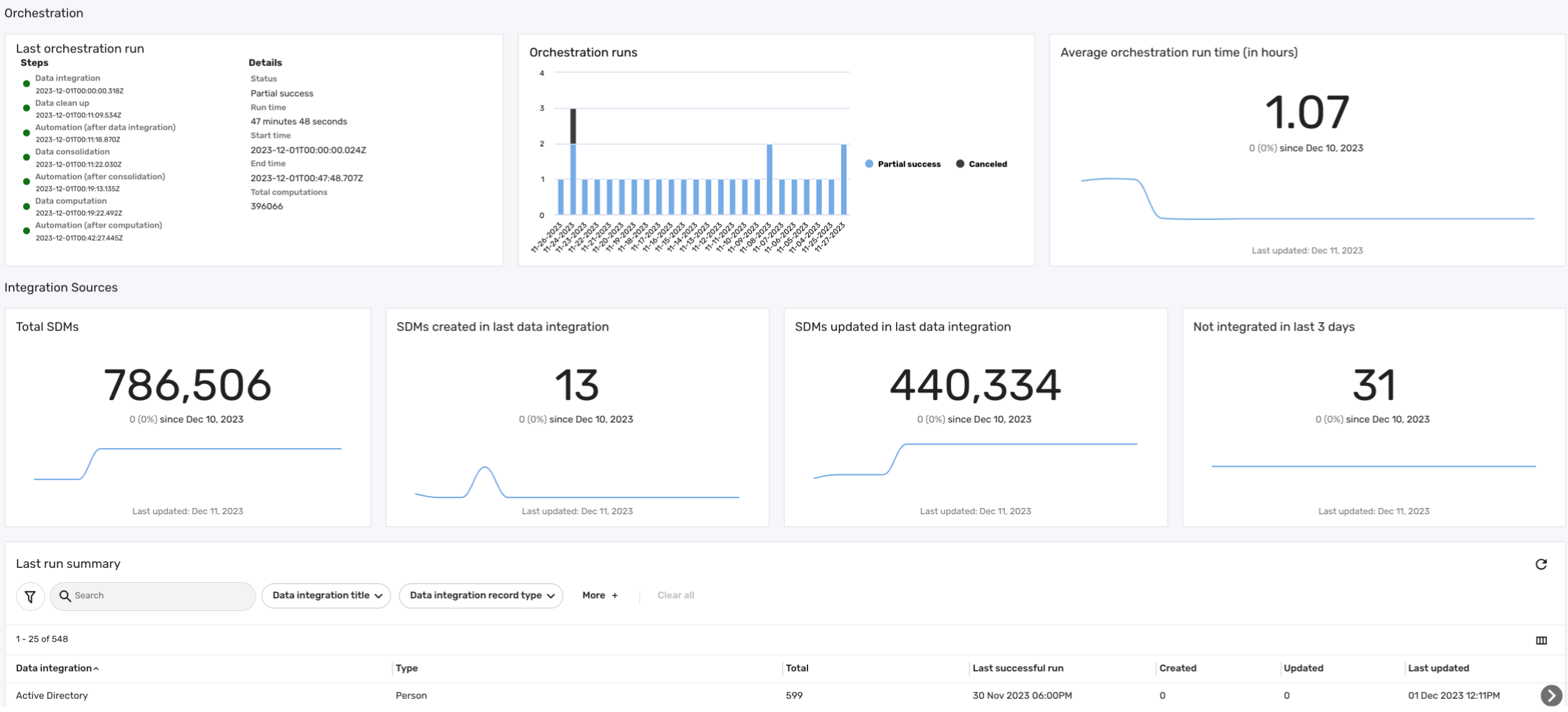
The Operations dashboard provides administrators with an in-depth view of the Brinqa Platform's orchestration processes. This dashboard helps administrators quickly identify issues surrounding data orchestration, data integrations, and the volume of raw Source Data Models (SDM) being processed. This dashboard also provides insights into each integration's performance, such as data volume and sync frequency, helping administrators in decision-making to optimize the efficiency of the data orchestration. The following screenshot illustrates what your Operations dashboard may look like:
Key features
The operations dashboard includes the following sections:
-
Orchestration: This section of the operations dashboard offers insights into data orchestration. It provides details on the last orchestration run, including specifics of each step. Additionally, it gives an overview of all orchestration runs, detailing their status along with start and end times. This section also displays the average orchestration duration, measured in hours.
-
Integration sources: This section of the operations dashboard provides insights into new and modified SDMs based on the latest successful data integration runs, which helps distinguish between newly added and recently modified data. Additionally, it displays the total number of SDMs in the platform, and highlights the number of integrations that have not successfully brought in any new data over the past three days.
-
Last run summary: This table provides a comprehensive view of the history of data integrations, emphasizing the most recent successful operations and their impact on the SDMs.
The table below outlines the information included in the Last orchestration run card on the operations dashboard, including Data integration, Data cleanup, Automations, and Data consolidation, with details on start and end times, status, and more:
- This information is pulled from the orchestration logs history (Administration
 > Data > Orchestration).
 - The run times are based on the start and end dates recorded in the orchestration logs.
Table 1: Last orchestration run fields
| Orchestration Step | Description |
|---|---|
| Data integration | Start date and time of the data integration process. |
| Data cleanup | Start date and time of the data cleanup process. |
| Automation (after consolidation) | Start date and time of the automation process following data integration. |
| Data consolidation | Start date and time of the data consolidation process. |
| Automation (after computation) | Start date and time of the automation process following data consolidation. |
| Data computation | Start date and time of the data computation process. |
| Automation (after data integration) | Start date and time of the automation process following data computation. |
| Status | Status of the orchestration (success, partial success, failure, or canceled). |
| Run time | Duration of the orchestration run. |
| Start time | Date and time when the orchestration began. |
| End time | Date and time when the orchestration ended. |
| Total computations | The total number of records updated as a result of the last orchestration. |
System health dashboard
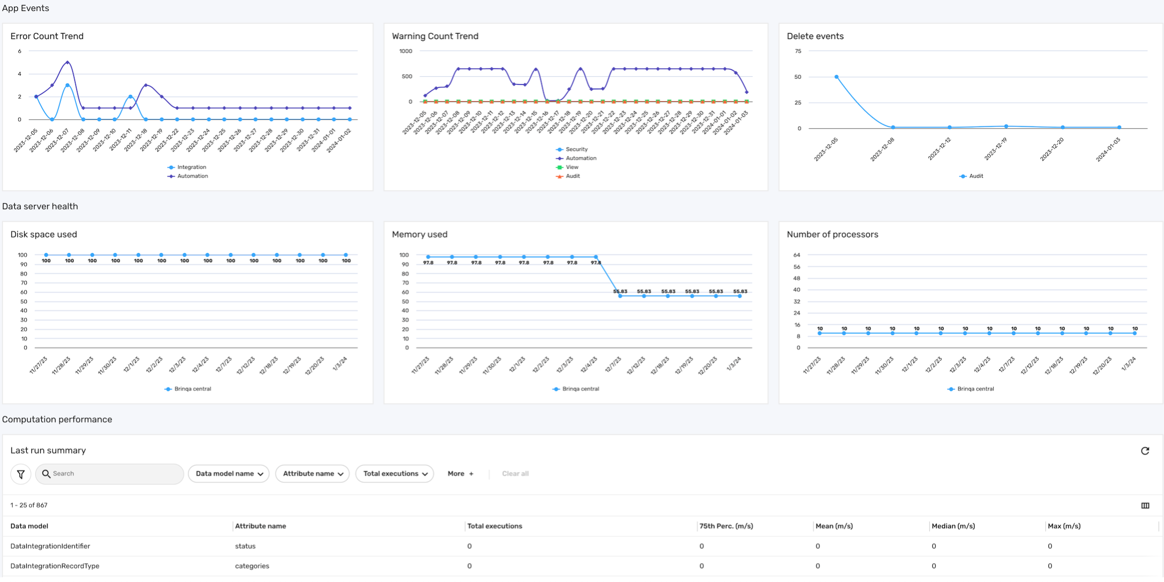
The System health dashboard is designed to monitor and provide insights into various aspects of the Brinqa Platform's system performance and data server health. This dashboard is important for administrators to ensure the smooth operation of the Brinqa Platform. The following screenshot illustrates what your System health dashboard may look like:
Key features
The system health dashboard is comprised of three sections: App events, Data server health, and Computation performance:
-
App events: This section gives administrators insights into the platform's stability, with an overview of errors, warnings, and deletion activities. It categorizes these events based on the categories found in the Application Event Logs, such as Audit, Automation, Computation, Integration, Security, and View. By analyzing data from the app event logs and the last orchestration run, it can help with identifying and addressing potential issues within the Brinqa Platform.
-
Error count trend: Displays the trend of error counts as determined by the app event logs, tracking the number of errors across each category.
-
Warning count trend: Indicates the trend of warning counts based on app event logs, tracking the number of warnings across each category.
-
Delete events: Monitors the count of delete events as recorded in the app event logs.
-
-
Data server health: This section provides a comprehensive analysis of the operational status of all your active data servers within the Brinqa Platform, excluding
local serversand any data servers that are offline or disconnected. It includes visualizations on disk space usage, memory consumption, and the number of processors, highlighting your data servers' storage capacity, efficiency, and processing power.-
Disk space used: Illustrates the amount of disk space utilized by the data servers, highlighting potential storage capacity issues.
-
Memory used: Shows the memory usage of data servers, indicating their operational efficiency and potential need for resource optimization.
-
Number of processors: Represents the number of processors available for use to the data server, aiding in understanding the potential processing power available for data handling and computation.
infoThe data server health metrics are only available after orchestration has run. Therefore, for newly added data servers, this information will not be immediately visible until after the completion of an orchestration run. This ensures that the data reflected in this dashboard is current.
-
-
Computation performance: This section provides a detailed overview of the computation efficiency within the Brinqa Platform. It features a Last run summary table that captures key metrics from the most recent orchestration run related to various data models and calculated attributes. This includes the total number of executions for each attribute, as well as the duration of these executions, indicated by performance metrics like 75th percentile, mean, median, and maximum, all measured in milliseconds. Brinqa administrators can analyze these metrics to identify slow-performing computations. For instance, a high mean value coupled with a significant number of executions can indicate a performance bottleneck.
User management dashboard
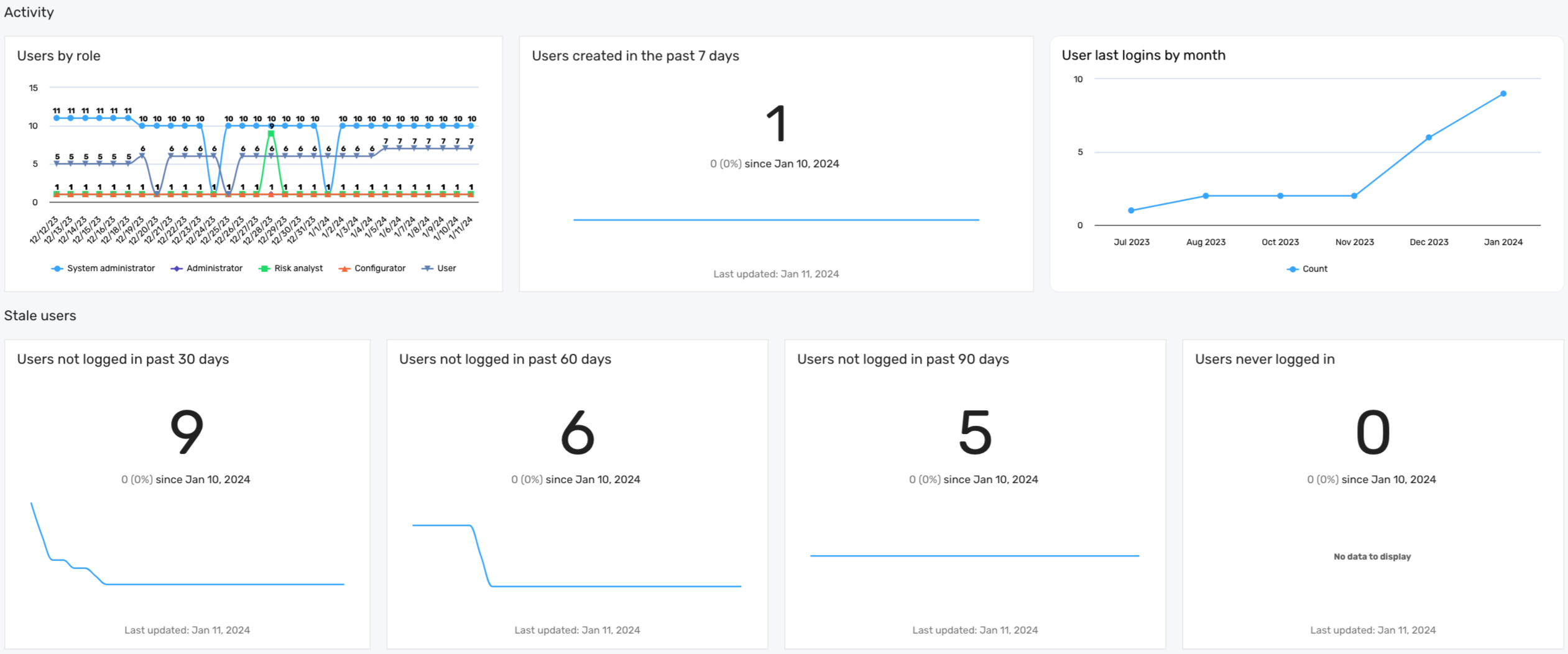
The User management dashboard provides an overview of user activity and role distribution within the Brinqa Platform.
By emphasizing the importance of active user monitoring, the user management dashboard supports Brinqa administrators in enforcing best security practices. Removing or suspending stale accounts not only tightens security but also optimizes resource allocation. Proactive monitoring and management of user accounts contribute to the overall health and security of the Brinqa Platform, ensuring that all users benefit from a secure and efficient environment.
The data in the user management dashboard reflects the most recent orchestration run; therefore, data for newly added users appears only after this process completes.
The following screenshot illustrates what your User management dashboard may look like:
Key features
The user management dashboard offers several key features, each providing insights into user activities and roles within the Brinqa Platform:
Table 3: User management dashboard features
| Feature | Description |
|---|---|
| Users by role | This graph displays the distribution of users across different roles, enabling administrators to ensure balanced access permissions. |
| Users created in the past 7 days | This graph highlights recent additions to the platform, providing insights into the influx of new users and assisting in their onboarding process. |
| User last logins by month | This graph showcases user login frequencies. This graph can aid in identifying active users and patterns in usage. |
| Stale users | This series of metrics highlights the presence of dormant accounts that may pose a security risk. It includes data on users who have not logged in for over 30, 60, or 90 days, as well as accounts of users who have never logged in. Regularly reviewing and addressing inactive accounts reduces the risk of unauthorized access and ensures that licenses are allocated efficiently. |