Report Sections
This article details the different report sections, which are the individual data visualizations on a report. Section types include graphs, charts, tables, and more. See report section types for the complete list. For a detailed tutorial on how to create a report with multiple sections, see the Build a Custom Report article.
Report section types
Sections on a report are individual data visualizations to display your data. To view the available sections, edit a report and click Add section  . The following table describes the different sections to choose from when creating your report:
Table 1: Report section types
| Section | Section icon | Description |
|---|---|---|
| Container |  | Displays a new container to house your sections. |
| Tabs |  | Displays charts and graphs in a tab. You can create multiple tabs and switch between tabs for quick navigation of different sections. |
| Bubble |  | Displays data in a bubble chart. Bubble charts are useful for displaying relationships of three numeric variables. |
| Scatter |  | Displays data in a scatter chart. Scatter charts are useful for displaying patterns, trends, or relationships between variables over time. |
| Line |  | Displays data in a line trend chart. Line graphs are useful for seeing comparisons of data over time. |
| Area |  | Displays data in a line trend chart with the area between the line and zero filled in. Area charts can be used any time a line chart would be, but are preferable when tracking multiple lines since the shading helps differentiate the elements being tracked. |
| Column |  | Displays data in vertical columns. Columns are useful when visualizing relative counts of data. |
| Bar |  | Displays data in horizontal bars. Bar and Column charts can be used interchangeably, but bars may work better when the bar labels are long. |
| Stacked bar |  | Displays two or more categories in vertical columns. Stacked bar charts are useful for when you want to compare multiple categories in one column. |
| Tabular |  | Displays data in a table. |
| Pie |  | Displays data in a pie chart. Pie charts are useful for displaying proportional information such as percentages. |
| Donut |  | Displays data in a donut chart. Donut and Pie charts can be used interchangeably. |
| Radial |  | Displays data in a radar chart. Radial charts are useful when you want to display data points between two or more sets of data. |
| Polar |  | Displays data in a circular chart. Polar charts are useful when you want to display data points between relationships. |
| Spider Web |  | Displays data in a spider chart. Spider charts are useful when you want to display data across several unique dimensions. |
| Heatmap |  | Displays data in the form of a heatmap. Heatmaps are useful for displaying information such as the concentration of certain events in certain times or locations. For example, the concentration of vulnerabilities by host and month. You can use different colors to indicate the level of concentration and whether that amount is problematic. |
| Treemap |  | Displays data in the form of a treemap, showing hierarchical data as nested rectangles. Treemaps are useful for displaying proportional information such as percentages according to more than one attribute. |
| Linear gauge |  | Displays a percentage value on a linear gauge. |
| Angular gauge |  | Displays a value on a gauge. |
| Single value |  | Displays a single value. For example, the total number of open tickets. |
| HTML |  | Displays a section of rich text created with HyperText Markup Language (HTML). HTML can be useful for adding formatted blocks of text to reports. See Supported HTML tags and attributes for additional information. |
| Text |  | Displays a custom text box on your report. |
| Icon |  | Displays an icon on your report. |
Add a section to a report
Before you can add sections to a report, you must create a report first. To add a new section to your report, follow these steps:
-
Edit your report and click Add section
. -
Select a section type and fill in the following information. The information may differ depending on the section type, but mostly remains the same across different sections:
-
Header: The title of your section.
-
Chart type: This field is set to the section type previously selected. You do not need to edit this field.
-
Data source: The data model that the section pulls information from. All data models in your Brinqa Platform are available for selection.
-
<>: Click<>to switch to the Advanced mode, where you can enter or update the query directly using the Brinqa query language (BQL). -
Measures: The measures for your section. Choose a function and how you want to display the measure. See Measures for additional information.
-
Dimensions: The dimensions for your section. Choose one or more attributes, how you want to display the attributes, and if applicable, specify a transformation or bucket. See Dimensions for additional information.
-
Sort by: How to sort the information displayed in the section. You can choose from the measure or dimensions selected in the previous step. You can sort in either ascending or descending order.
-
Filter: If required, add filters to limit the dataset for your section. When you click + to add filters, a new window appears. Fill in the following fields:
-
Attribute: The attribute for which to add the filter.
-
Operator: The operator to use.
-
Value: The value that the operator compares the data to.
-
-
Ignore input filtering. Choose this option to ignore the filters designated for the entire report. See Add inputs for more information.
-
Limit: The number of rows or columns of information to display in the section.
-
Stacking: This option is available only in Line, Column or Bar graphs. It indicates whether different data from the same attribute appears separately or stacked. Choose from the following options:
-
None: The data is not stacked.
-
Normal: Shows data stacked into one column or bar.
-
Percent: Shows data stacked into one column or bar, but the length represents percentage.
-
-
X-Axis: The dimension attribute to display on the X-axis of your graph.
-
Y-Axis: The dimension attribute to display on the Y-axis of your graph.
-
Series: The measure you have selected.
-
Group by: The dimension attribute or measure to group your data.
-
Display value: This option is available only in Linear gauge, Angular gauge, or Single value graphs. It represents the value you want to display in your section.
-
-
Click Update to save your section.
Repeat these steps for each section you want to add to your report. When you add a new section, the new section lays on top of the existing one. You can move it around to a more desirable spot.
Measures
Measures are aggregate calculations performed on the records in your Brinqa Platform. You select a function and the data model to perform the function. For example, if you select the Ticket data model and the Count function, the calculation you receive is the total number of tickets in the instance. The following table details the different measure functions:
Table 2: Measure functions
| Function | Description |
|---|---|
| Average | The average value of the selected attribute. The average function can only be applied to attributes that are numeric. |
| Count | The sum of records in the Brinqa Platform. |
| Count Unique | The sum of unique records in the Brinqa Platform. |
| Max | The current maximum value of the selected attribute. The Max function can only be applied to attributes that are numeric. |
| Min | The current minimum value of the selected attribute. The Min function can only be applied to attributes that are numeric. |
| Percentage | The percentage of records with the selected attribute, comparison operator, and value. |
| Sum | The sum of values of the selected attribute. The Sum function can only be applied to attributes that are numeric. |
Dimensions
Dimensions are the data groups for the selected measure. For example, in a section containing total tickets per month, "total tickets" is the measure and "per month" is the dimension. The count of tickets is divided into groups based on the month in which they are created.
All data model attributes are available as dimensions to select from. However, some dimensions make more sense than others as sorting options. The dimensions that do not make good candidates for dimensions are those with completely unique attributes such as ID.
You can select multiple dimensions for the same section, for example, total vulnerabilities per business unit per quarter.
Transformation
Dimensions that use timestamp attributes have a Transformation option, which allows you to determine the granularity of the dimension. For example, you can look at the year, quarter, month, week, or day of the timestamp.
Buckets
Dimensions that use numeric attributes (including timestamps, which are stored as integers) have a Bucket option. Buckets allow you to set ranges for dimensions. For example, vulnerability risk scores span from 0 to 10, but you can put them into buckets of low (0-2), medium (3-6), and high (7-10), if that is a more desirable way of viewing the information. These ranges are inclusive, which means that risk scores from 0 to 2, which include 0 and 2, belong in the low bucket.
Add a section to a page
In addition to adding sections to a report, you can also add sections to a list view page that supports it, such as the Groups, Inventory, Findings, or Remediation page. To do so, follow these steps:
-
Navigate to a list view in your Brinqa Platform. For example, Findings.
-
Click Edit on the upper-right corner.
-
Click Add section
.
Refer to report section types for information on the different types of section you can add to a list view page, and customize section appearance for information on how to edit the sections.
Supported date formats
The following date formats are supported in report charts and visualizations.
-
AgeInDays: Calculates the number of days from the specified date to the current date. For example, using
AgeInDays(f.dateCreated)in a query returns30given the below assumption. -
AgeInMonths: Calculates the number of months from the specified date to the current date. For example,
AgeInMonths(f.dateCreated)returns1given the below assumption. -
AgeInYears: Calculates the number of years from the specified date to the current date. For example,
AgeInYears(f.dateCreated)is0given the below assumption.noteFor the AgeInDays, AgeInMonths, and AgeInYears examples, we assume that
fis an alias for findings,f.dateCreatedis June 1, 2024, and the current date as July 1, 2024: -
Date Time: The date and time in the format of
MM-dd-yyyy hh:mm:ss. For example,07-01-2024 12:35:00for July 1, 2024 at 12:35 PM. -
Date: The date in the format of
MM-dd-yyyy. For example,07-01-2024for July 1, 2024. -
Day of the week: The day of the week in abbreviation. For example,
Tuefor Tuesday. -
Day of the week (numeric): The day of the week in numeric form with a leading zero, starting from Monday
01to Sunday07. -
Day of the year: The days in the calendar year numbered in sequential order. For example,
182for the 182nd day of the year. -
Day: The day of the month with a leading zero. For example
01for the first day of the month or31for the 31st day of the month. -
Month of the year: The month and year in the format of
MMM yyyy. For example,Jan 2024for January 2024. -
Month: The month of the year in the format of
MMM. For example,Janfor January. -
Month (numeric): The month of the year in numeric form with a leading zero, starting from
01for January to12for December. -
Quarter: The quarter of the year. For example,
Q1 2024for the first quarter of 2024. -
Week of the year: The week number in the year, from
01to52. -
Year: The year in the format of
yyyy, e.g.,2024.
In addition to the predefined formats, you can define custom date formats using the dateFormat function defined in Java’s SimpleDateFormat documentation. For example, to display the year and month as 24-07 for July 2024, you can use: dateFormat(f.dateCreated, "yy-MM").
Supported HTML tags and attributes
You can enrich your reports and visualizations with custom formatted text and elements through the HTML report section. The Brinqa Platform supports a curated set of HTML tags and attributes for the HTML section.
HTML tags
The Brinqa Platform allows for a wide range of HTML tags, catering to various content structuring and formatting needs. Here's a list of the supported tags:
-
Heading tags:
h1,h2,h3,h4,h5,h6 -
List tags:
dl,dt,dd,li,ol,ul -
Structural tags:
address,article,aside,div,figure,figcaption,footer,header,hgroup,main,nav,section -
Table tags:
caption,col,colgroup,table,tbody,td,tfoot,th,thead,tr -
Text formatting tags:
a,abbr,b,bdi,bdo,blockquote,br,cite,code,data,dfn,em,hr,i,img,kbd,mark,p,pre,q,rb,rp,rt,rtc,ruby,s,samp,small,span,strong,sub,sup,time,u,var,wbr
HTML attributes
The following attributes can be applied to any of the above tags to further define classes, unique identifiers, and styles:
- Global attributes:
class,id,style
The following attributes are specific to certain HTML tags:
-
<a>Tag attributes:href,name,target -
<img>Tag attributes::src -
<td>and<th>Tag attributes:colspan,rowspan
Customize section appearance
After adding a section to a report, you can modify its appearance including the colors, grid lines, max values, background, borders, and more. Most of the sections have the same customization options, but some have slightly different modals depending on the section type.
To customize the appearance of a section, follow these steps:
-
Navigate to Analytics > Reports and choose the report containing the section you want to modify.
-
Click Edit and click the section you want to customize.
-
Click the Style tab and edit the following fields as needed:
-
Size and position: Edit the width, height, or both of your section. You can also enable Auto position. To update the padding, select Override padding and specify the new values.
-
Background and border: Edit the background and border color, border width, border radius, or add a border shadow to your section.
-
Text: Edit the text color, font size, and text alignment in your section.
-
Hint: Leave a hint for the section, which displays an information icon
 next to the section title. The hint displays when you place your pointer over the icon.
 -
Color: Edit the colors of your section.
-
Color by data point: Displays data points in different colors by their shared x-axis value. All data points with the same x-axis value are in the same color.
-
Conditional colors: Specify a specific color to represent a value in the report. For additional information, see Conditional colors.
-
-
Options: General options for displaying the section.
-
Empty values: What to do if there are empty values in the data.
-
None: Shows a gap in the chart where the missing data is.
-
Connect: Connects the data points on either side of the missing data.
-
Zeroes: Replaces the missing data with zeros.
-
-
Zooming: Allows you to zoom in closer on certain graphs.
-
Show value: Displays the exact values associated with the measures and dimensions selected for the section.
-
Show summary: In a table, displays data associated with the measures and dimensions selected for the section.
-
Show grid lines: Displays grid lines on the graph.
-
Smooth line: Makes lines and area-chart lines less angular.
-
-
Horizontal axis: Edit the x-axis of your chart.
-
Title: Edit the title of the axis.
-
Type: Edit how data should be plotted on the axis.
-
Linear: Displays data linearly.
-
Logarithmic: Displays a straight line when data is on a logarithmic or exponential scale.
-
Category: Displays the point names of the chart's series.
-
-
Size: Determine the minimum and maximum values along the axis and at what interval the grid lines should occur.
-
Reversed direction: Reverses the sorting of values along the axis.
-
Plot line: Displays a horizontal line marking a specific value. If selected, you can specify the position on the axis where the line displays, as well as the color, type, and width of the line.
-
Labels format: Characters can be added before or after the label using the {value} syntax. For example, {value}% converts labels like 10, 20, 30, and 40 to 10%, 20%, 30%, and 40%.
-
-
Vertical axis: Edit the y-axis of your chart.
-
Title: Edit the title of the axis.
-
Value: Edit the measure or dimension you want to display on the axis.
-
Type: Edit how data should be plotted on the axis.
-
Linear: Displays data linearly.
-
Logarithmic: Displays a straight line when data is on a logarithmic or exponential scale.
-
Category: Displays the point names of the chart's series.
-
-
Group by: The measure or dimensions by which to group the data.
-
Labels format: Characters can be added before or after the label using the {value} syntax. For example, {value}% converts labels like 10, 20, 30, and 40 to 10%, 20%, 30%, and 40%.
-
Reversed direction: Reverses the sorting of values along the axis.
-
-
Number formatting: Format the numbers along the axis.
-
Delimiter: The punctuation mark to separate groups of thousands.
-
Decimal Mark: The punctuation mark to indicate decimal places.
-
Decimal Places: The number of decimal places to display.
-
-
Tooltip: Enable hints and share the hints between series.
-
Legend: Specify if and how to display the legend on the section.
-
Actions: Enable the Fullscreen or Stats options and choose where to place them, in the header or footer of the section.
-
Conditional display: Choose what to display when a certain condition is met.
-
Missing data: Decide what to display if data is missing from your section. If not configured, the system displays "No data to display" in the section.
-
Drill down: Decide what happens when you click on a specific dataset in your report. For additional information on how to configure a drill down, see Drill-downs.
-
-
Click Update to save your changes. The page reloads and the section updates. If your section does not update, you may need to refresh your browser.
Conditional colors
Conditional colors enable you to enhance the visual representation of your reports by applying specific colors based on certain values. By using conditional colors, you can:
-
Highlight high-risk items in red, medium-risk items in yellow, and low-risk items in green, for example.
-
Differentiate key performance metrics by color-coding those that exceed, meet, or fall below targets.
-
Indicate various statuses such as active or inactive with distinct colors.
To use conditional colors, follow these steps:
-
Navigate to Analytics > Reports and choose the report containing the section you want to modify.
-
Click Edit and then click the section you want to add conditional colors to.
-
Click the Style tab and locate the Color section.
For this example, we're using a bar chart for findings and their severity levels. The following screenshot illustrates what the colors may look like before using conditional colors:
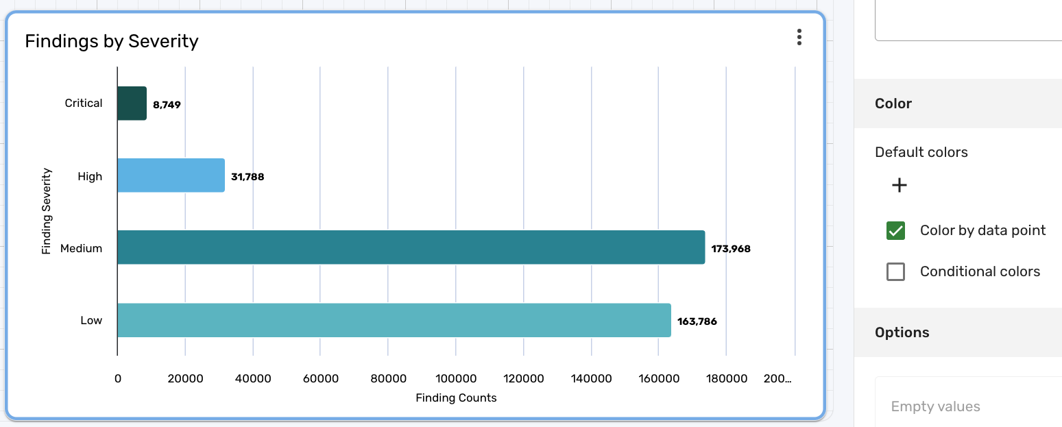
-
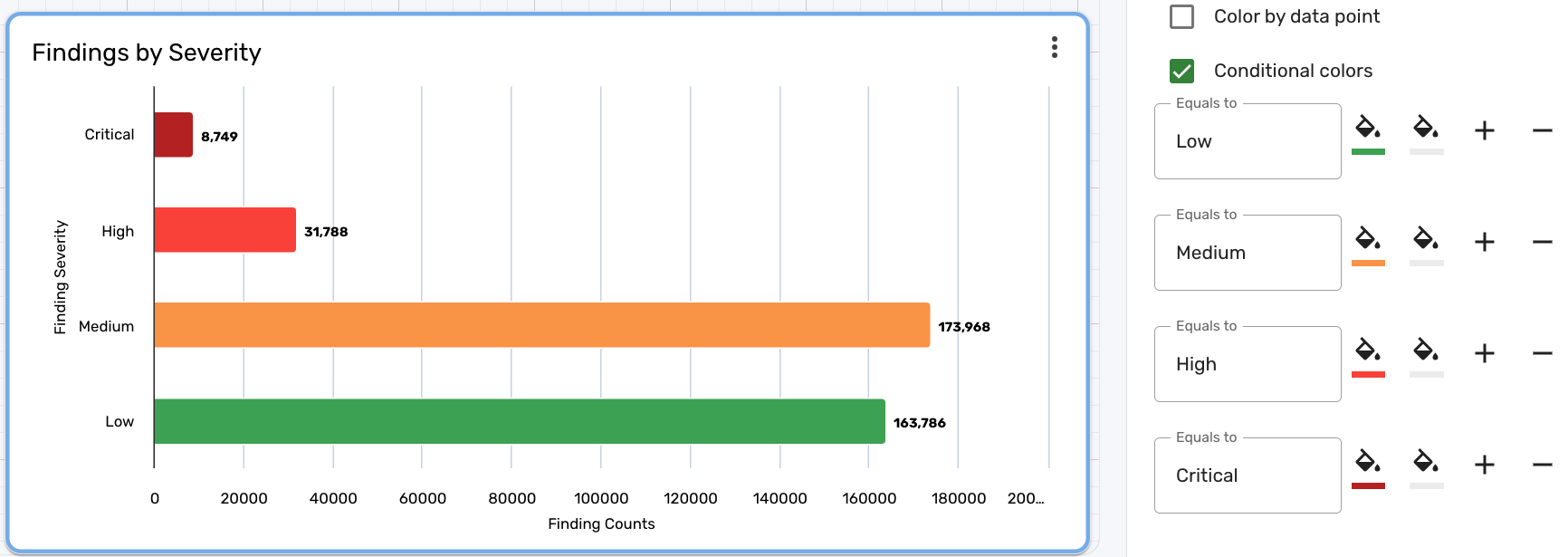
Color by data point is selected by default. Uncheck it and click Conditional colors to enable conditional coloring. When you check Conditional colors, more options appear.
-
In the Equals to box, type the exact name of the value you want to set a color for. For example, to specify a color for the
Criticalseverity level, type "Critical" in the Equals to box.cautionThe text in the Equals to box is case-sensitive and must be an exact match in order to work properly. For example, if you were to type "critical", the conditional color does not apply properly. You must type "Critical" with an uppercase "C". The same applies to "Low", "Medium", and "High".
-
Click the Background color paint bucket icon and select a color for the bar. For example, a finding with a critical severity may best be represented by a dark red color, low by a light green color, and etc.
-
(Optional) Click the Text color paint bucket icon and select a color for the text.
-
Click + and repeat steps 5-7 for each value you want to apply conditional coloring to.
-
Click Update to finish and update the chart.
The following screenshot illustrates what the colors of the chart may look like after using conditional colors for the same chart as before:
Drill-downs
"Drilling down" enables you to decide what happens when you click on a value in a report section. Drill-downs let you navigate to different views and pages directly from your report, transforming your static report into a dynamic and interactive report. You can configure the drill-down to link to a list view, detail view, dashboard, or another report.
Drill-downs using date attributes, such as dateCreated or firstSeen, are not currently supported.
To configure a drill-down, follow these steps:
-
Navigate to Analytics > Reports and choose the report containing the section you want to modify.
-
Click Edit and then click the section you want to add a drill-down for.
-
Click the Style tab and then click Create drill down.
noteIn Brinqa Platform version 11.31 or later, the Drill down section is located in the Setup tab.
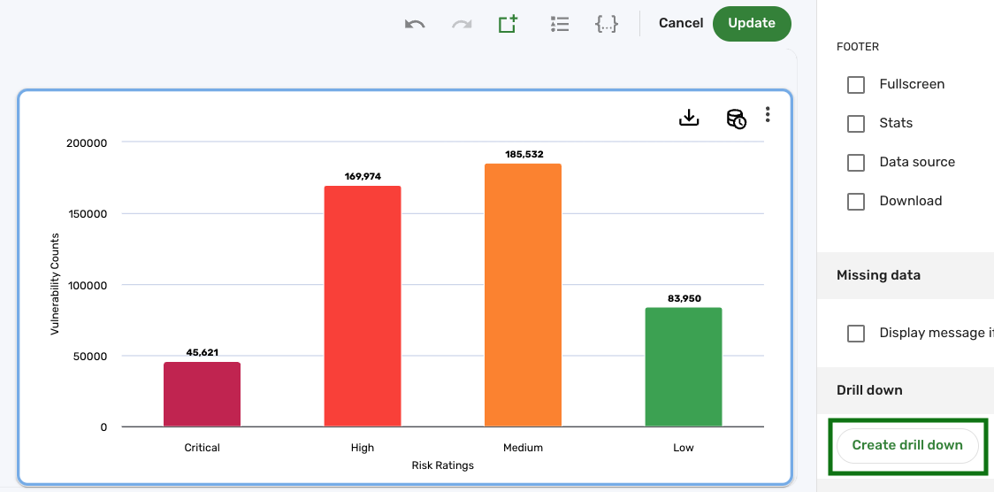
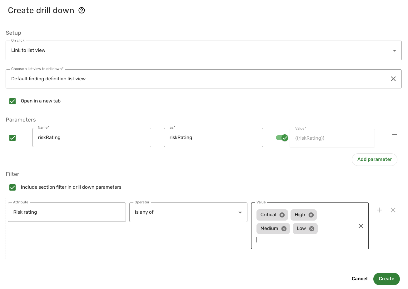
The Create drill down window appears. Complete the following fields:
-
Dimension drilldown: This option only appears if you are configuring a drill-down for a Tabular chart. If toggled, a Columns drop-down appears, displaying any dimensions configured for the current chart. If enabled, the available fields are the same as the ones throughout the rest of this section.
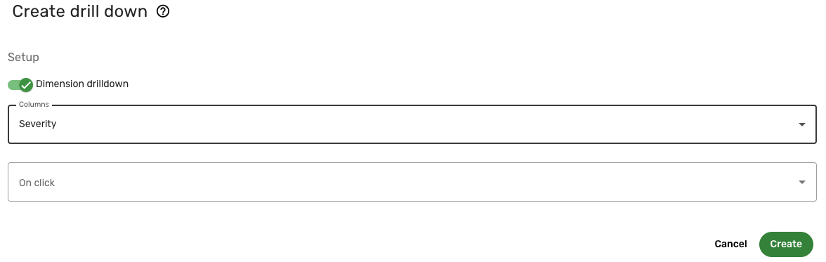
-
On click: Choose what to do when you click a specific item in the section. For example, to navigate to a list view, click the drop-down and select Link to list view. More options appear below based on your selection.
-
Choose a list view to drilldown: This field automatically populates with the recommended view based on the dataset of the report. For example, if you selected Link to list view and created a report for finding definitions, the Default finding definition list view is selected. You can choose a different list view if desired.
-
Open in new tab: This option is enabled by default. If you want the drill-down to open in the same tab, you can disable this option.
-
Parameters: The attributes used to build the list view. By default, the system uses the attributes you have selected as dimensions for your chart, but you can add or remove them as needed. It also uses the inputs present in the report. The parameters use the following syntax:
-
Name: The name of the attribute. This field automatically fills with the information you created in the report section. For example, if you created a report for finding definitions by risk rating, riskRating is filled in by default.
-
as: How to display the attribute in the section. For example, Risk rating.
-
Value: The value of the attribute. For example, if Risk rating is the attribute, you can use {{riskRating}} to dynamically control the drill-down. This means that when you click a specific risk rating in the report, the drill-down takes you to the list view of the records with that risk rating.
-
Add parameter: Add an additional parameter to the drill-down. The available parameters to choose from include the following:
-
Dimensions of the current chart: Any dimension that has been configured for the current chart is available to select from the drop-down.
-
Select an attribute from the dataset: This parameter is only available when you are configuring a drill-down for a chart in a detail page. It enables you to add parameters specific to that dataset.
-
Select an attribute from the logged in user: This parameter includes information about the user currently logged in. You can include parameters related to the logged-in user to customize the drill-down based on user-specific data.
-
Insert static parameter: A parameter written by the user. For example, you can set a static parameter with a hardcoded value such as
status: active. This will send a fixed value in the URL, ensuring that the drill-down always includes this parameter.
-
-
-
Filter: (Optional) If you select Include section filter in drill down parameters, any filter you have set for the section displays. You can also add more filters with the following syntax:
-
Attribute: Click the drop-down to view the list of available attributes to choose from. These attributes are specific to the dataset being used in the report section.
-
Operator: Click the drop-down and select the BQL operator you want to use in the filter. For additional information, see BQL operators.
-
Value: The value that the operator compares the data to. For example, if risk rating is the attribute, you can select High and Critical as the only risk ratings to display in the report section.
-
-
-
Click Create.
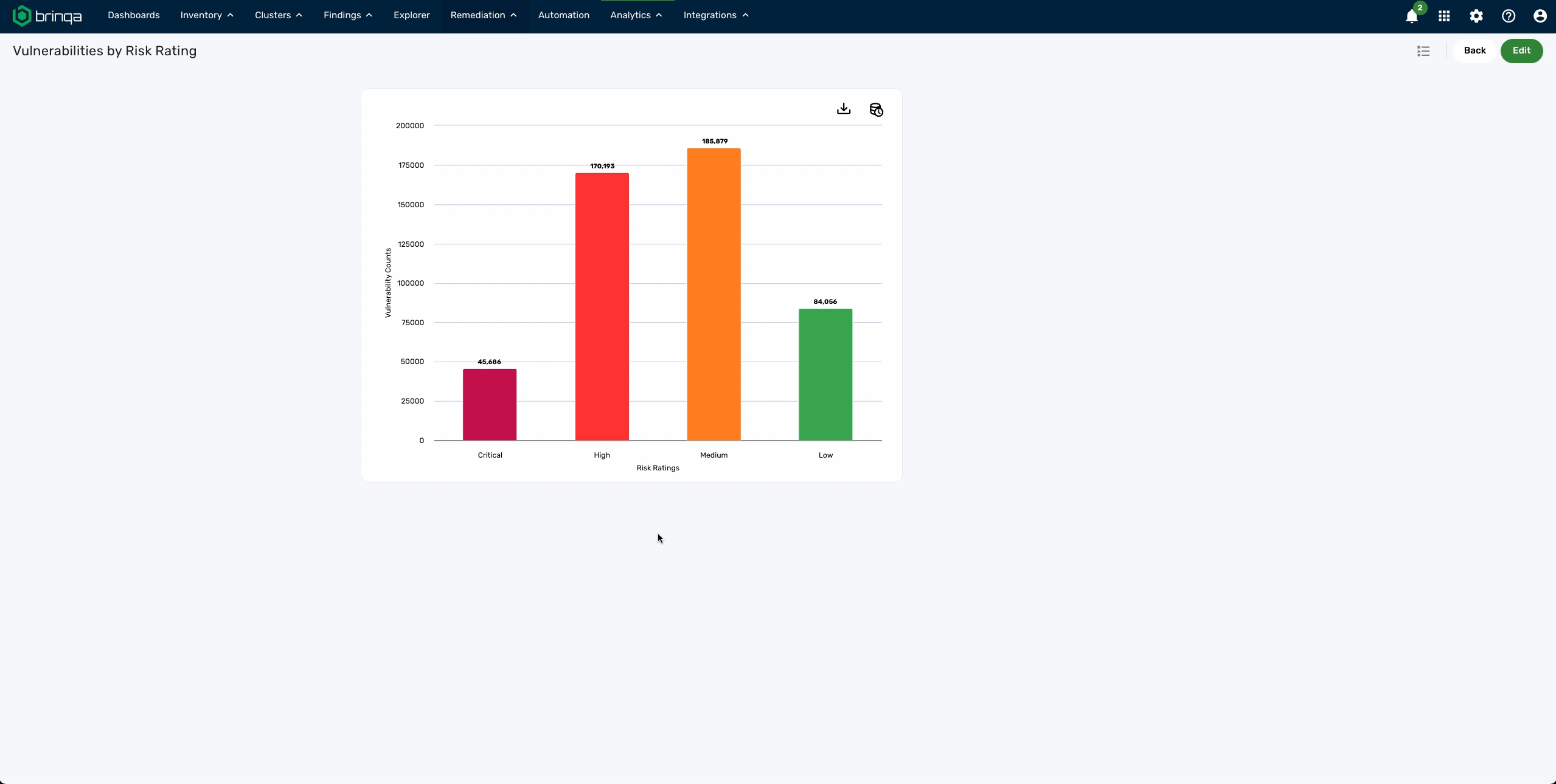
The following screenshot illustrates what a configured drill down may resemble for a section that drills down to the finding definition list view, along with a filter to only include risk rating levels for Low, Medium, High, or Critical finding definitions:
In the resulting report, if you click the "Critical" column, it takes you directly to the finding definition list view for critical finding definitions:
View source
While editing a report section, you can view, edit, or copy the source code for the entire report section. To view or edit the source code of a section in the report, follow these steps:
-
Navigate to Analytics.
-
Click the report that contains the section you want to view or edit the source code for.
-
Click Edit.
-
Click the kebab menu
 on the section and click Edit source.